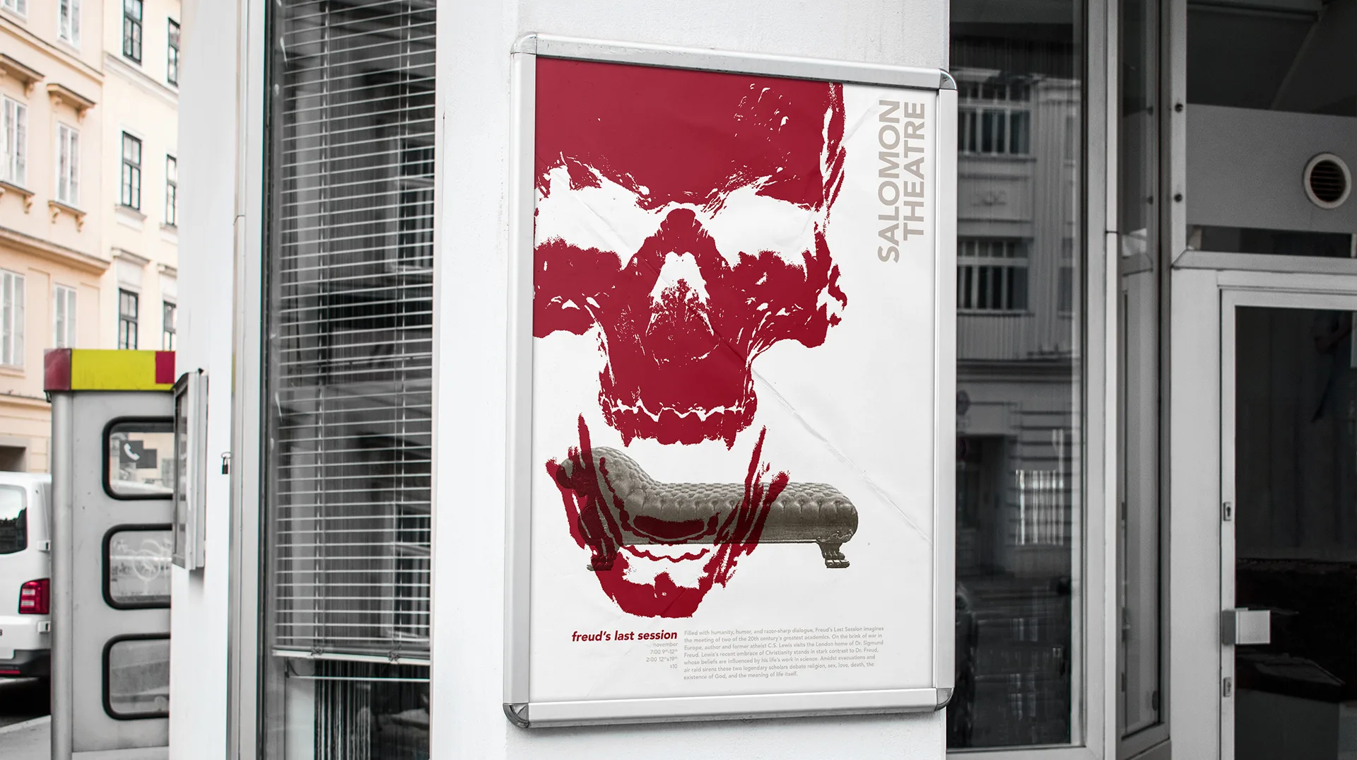
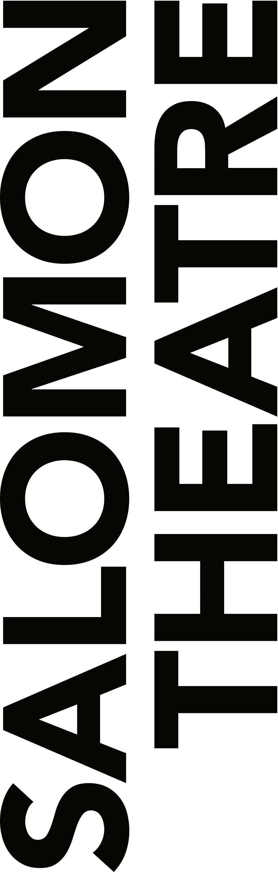
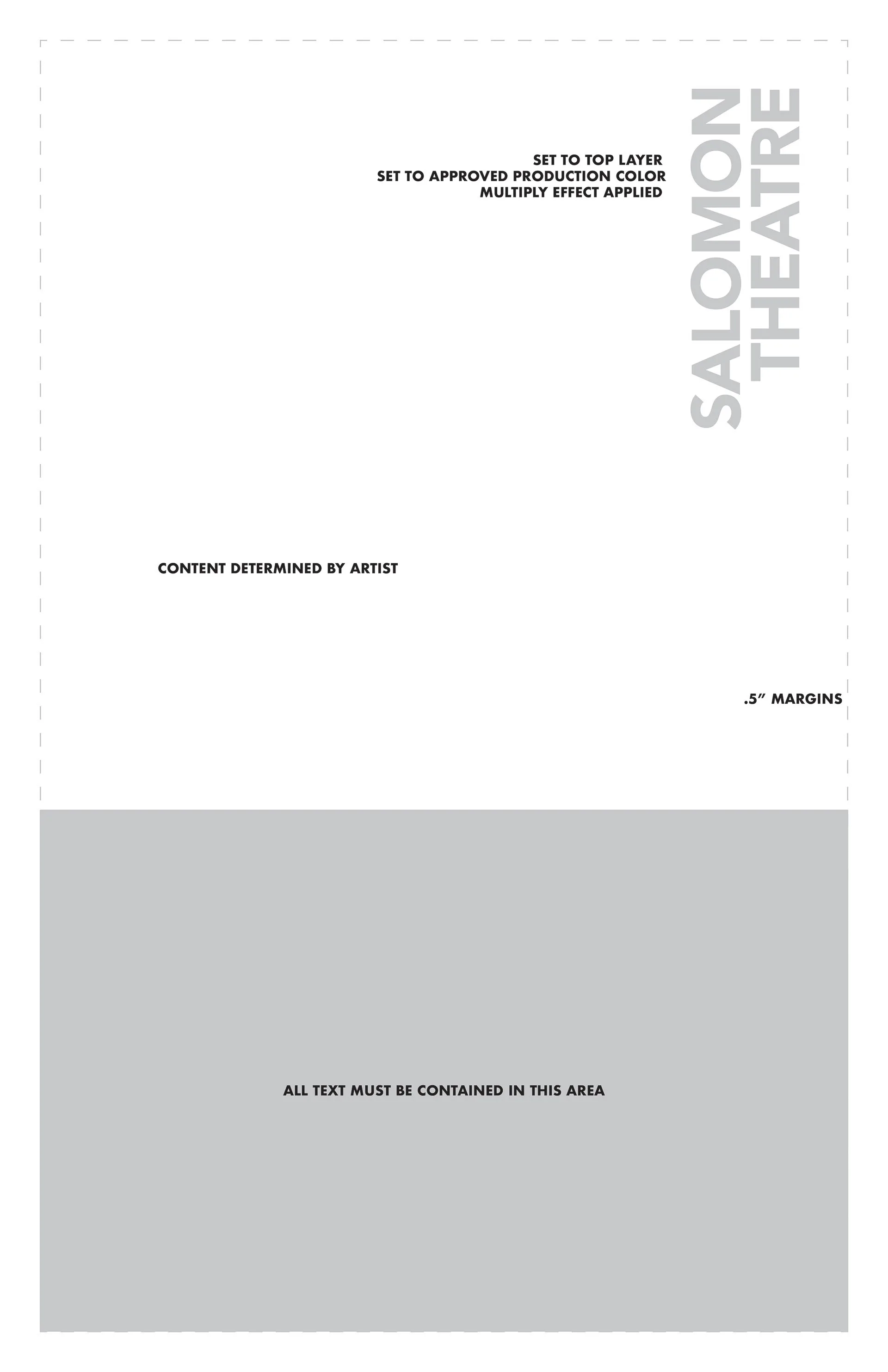
This is the graphic identity for the Salomon Theatre, a student and faculty run theatre on the campus of PLNU. Because the Salomon Theatre employs many different designers and artists, the identity needed to be flexible enough to work with any artist’s style and easy enough for any designer to apply. The wordmark stacks SALOMON THEATRE vertically in bold geometric capitals, so it runs along the edge of a poster and leaves the rest of the page to the artist. The guidelines turn that into a simple template: the wordmark sits on the top layer in an approved production color with a multiply effect, the artist determines the content, all text stays inside a set area at the bottom, and every layout keeps half-inch margins. The poster for Freud's Last Session shows the system at work, with a distressed red skull filling the page and the wordmark running up the right side. Below are the bulletins and posters I made during my tenure as a designer for the Salomon Theatre as well as the brand’s guidelines.